The timely updates in the user-friendly features are what make Google chrome the favorite default browser for all. Earlier where Google was in news for bringing self share feature and introducing android games for desktop users, this time the talk is about getting a modified logo design. Yes, Google Chrome gets a new logo after eight years! What does the Google Chrome new logo look like?
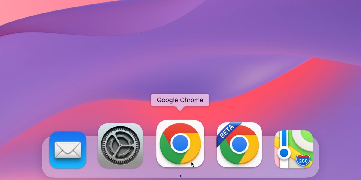
Elvin Hu, the designer at Google Chrome, offers a first glimpse of the logo’s new design in a thread on Twitter. The logo has been simplified or flattened by removing shadows. Google is also tweaking it further, with different versions designed to make it look more like a native across Windows, macOS, and iOS.
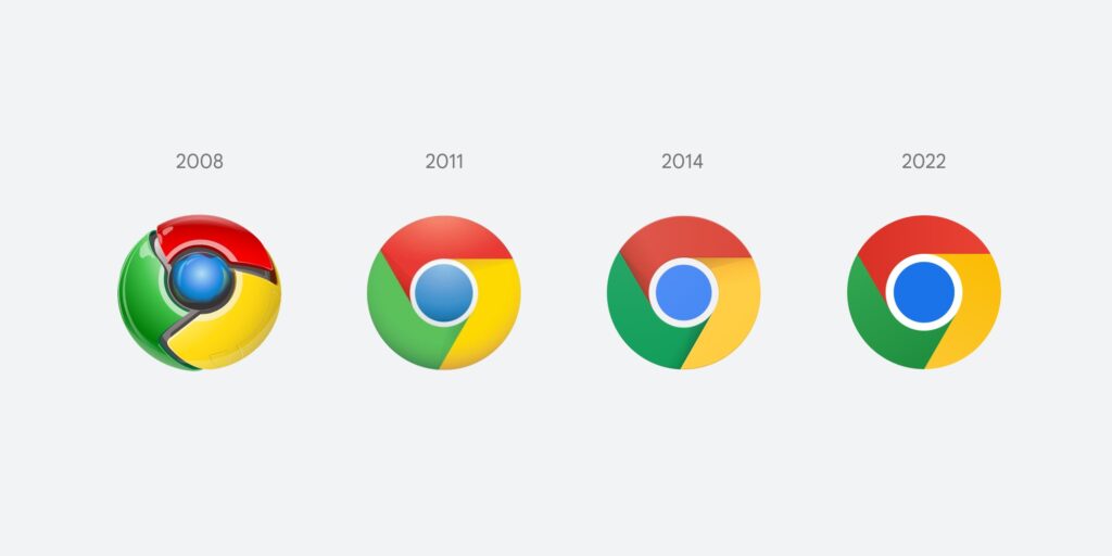
The colors are more vibrant in the Google chrome new logo, and the proportions differ, making the blue ball in the middle appear larger. From 2008 to the present from 2008 until now, the Chrome logo has been becoming more and more straightforward. It was initially an opulent, three-dimensional symbol has now been reduced to a 2D symbol of modernity.
Not to forget how the default search browser is doing the best efforts to remain the first choice for browsing by making the Google Apple deal. And now bringing this fresh change in the logo after 8 long years, users can expect a lot more upgrades in the coming years!
How Google Chrome New Logo Will Look Like?
A designer from Google Chrome, Elvin Hu, has posted the latest Google Chrome logo onto Twitter. In his tweet, the designer has arranged all the old Google Chrome logos along with the new logo to make it easier for people to spot the difference.
As mentioned by Elvin Hu, one of Google Chrome’s designers, the brand’s new logo does not feature shadows.
The four colors used in the logo are yellow, green, red, and blue, which are more vibrant than they were before.
The new logo features an elongation in a red hue to prevent the unpleasant vibrations of color. The logo is customized for various operating systems, such as Windows and macOS.
There are also new icons for both the developer and beta variants of the Chrome logo. The most striking modification is a blueprint-style symbol for the beta version for iOS.
He adds that design teams played using a white line that acts as a boundary between each color, but they discovered that this made the whole icon smaller, making it difficult to distinguish from the other Google apps.
Also, have a look at Google Chrome Flags To Boost The Browsing Experience!
Difference Between Earlier Chrome Logos And The New One?

Chrome is changing its branding for the first time since the year 2014. The fourth time that the logo has changed is in the 14 years of the birth of Chrome. The Chrome logo is gradually becoming more straightforward since the year 2008. At first, it was an attractive, three-dimensional logo. Then it was changed to a 2D logo.
Google Chrome browser has been extremely inline in its visual brand identity. After its introduction in 2008, its famous swirl of multicolor became synonymous with the web browser and didn’t have to be replaced with any other symbol.
Original Emblem
From the very beginning of the version from the very beginning, the Chrome icon has been using colors derived from every alphabet from the Google wordmark. Since the four hues are within the Google wordmark, the quantity of colors available in the Chrome palette is also identical (plus black borders).
Google Chrome Logo In 2008 – 2011
The logo, which was adopted by the web browser in 2008, featured the appearance of a three-dimensional round figure comprised of three equally sized segments and an elongated blue sphere within the middle.
Each segment was cut diagonally across its sides and created the impression of a swirling and moving motion and bringing a sense of dynamic and speed. The three segments were adorned with yellow, red, and green hues and, in conjunction with blue, formed the color palette. It reflected its ties to that of the Google Company and showed the web browser’s infinite possibilities to its users.
Google Chrome Logo In 2011 – 2014
The logo was simplified in 2011, after which the three-dimensional appearance and shiny surfaces were eliminated. The logo was flat.
However, it had shadows that created a feeling of motion. The blue circle in the middle was created with gradient shades, and its matte surface resembled an earth globe.
Google Chrome Logo In 2014 Till Today
The logo was updated in 2014 and reduced, even more, replacing the blue gradient with a simple light blue. The outline was changed from gray to white and expanded. For the segments that were colored, their contours and shadows were slightly smoothed.
What do you think Google Chrome Vs Firefox Browser: Which is better?
Final Thoughts
So, this is what the Google Chrome new logo will look like. The color scheme hasn’t changed much in any way, with blue, red, green, yellow, and red remaining the primary colors.
However, the intensity has been increased by a bit, and shadows have been removed. Overall the new logo looks similar to the old one but appears more vibrant.
Tell us how do you like Google Chrome’s new look in the comment box below? Also, stay tuned for more juicy updates!

